Shift can happen anywhere in the printing process, but if the process is set up with visual expectations which can’t possibly be matched, the process is set up for disappointment.
When a designer creates files using their design tool of choice, there are input files which determine the color assignments which are conveyed on the designer’s monitor. What the designer sees is what the designer expects. Right or wrong, this is the visual expectation. We all know that most designer’s don’t profile their monitor each morning, let alone each week or month (or maybe ever). But none the less, if the input profile is set to something different than your print process, expectations will not be met.
Default color settings within Adobe programs follow conventional offset color spaces which use ISO inks and set paper white. As you know by now, whether the ink is aqueous or UV, inkjet is not the same as conventional offset. The ink colors and the paper are not standard. Some ink and paper combinations such as “true” coated and highly calendared paper grades can, in fact, closely simulate conventional Web Coated SWOP or GRACol Coated color spaces, but depending on the print heads, drop size, ink volume, paper type, grammage, ink type and ink limiting, those color spaces will shift and can become smaller. The performance of the ink on each substrate changes based on how the drops react, spread, cure, dry and absorb. This paper-relative performance is the cause of significant shift.
What if your inkjet device can successfully print to a wider color space than the assigned input profile? If a PDF is converted to a particular color space, then available colors are modified to fit within the assigned color space and color could be limited. Depending on what the designer is working on, this could be critical. Items such as comic books and color designs which I like to call “circus color” can be reduced leaving a dull appearance.
This is why it is so important for designers to understand and use the simulation profile of the Machine, Ink and Media, or MIM. They should be aware of the possibilities of how inkjet and media choices can limit or exceed their color expectations. Seeing this on screen as they are designing is a good way to set the right expectations up front.
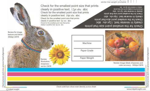
Designers which soft proof with a specific simulation MIM profile will visually see the color shift on screen when using production color profiles off any of your print devices. The screens captures below represent the color shift which can happen between on screen Web Coated SWOP input profile compared to a simulation profile representing aqueous pigment inkjet printed on treated inkjet paper.

US Coated SWOP

Simulation Profile Treated Inkjet 60#
Supplying simulation profiles to designers will create a more compatible visual design environment which is easily integrated into their default input color space settings. Simulation profiles are not a replacement for default input profile settings, but rather a viewing option which they can use to proof on screen. This is called a soft proof and is not included in the final PDF configuration, but only used during the design process. A visual representation of how the colors may shift in or out of gamut allows designers to add filters or choose colors which could be in-gamut of the press MIM. This same simulation profile can be applied to an incoming PDF file for pre-press to understand what the impact of their press settings will have on the color space of the file.
The input profile which they assign visually conveys an ink’s color as it would be printed with a specific paper, so if they are not using your simulation profiles, they could be designing to a non achievable color space or reducing their own color opportunities.
Which is just self inflicted shift. And shift designers shouldn’t have to deal with. Right?
