By Mike Todryk
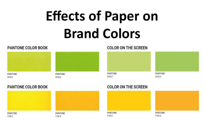
I recently had the privilege to participate in a webinar for Inkjet Insight, discussing paper with the fabulous Mary Schilling. We covered many great topics and addressed several points to consider when selecting paper to use with your inkjet press. One thing that I have been thinking of a lot recently is how different paper stocks can affect brand colors, and how many lack knowledge of that fact. As a follow up to our webinar, I would like to share some thoughts on that topic.
While I have been in the printing industry about 24 years, I have been playing around with word processing and design software since about 1994. I remember some of the early WYSIWYG (What You See Is What You Get) software and how revolutionary it seemed. What you saw on the screen was how it was going to output. As anyone from that time remembers, that was almost never the case in practicality. Design software has improved so much from those early days of Quark and PageMaker that at times we have become a little spoiled. We see these beautiful designs on our huge full-color monitors, and we just assume that that is how the final piece will look, regardless of paper stock. In addition, much current design is done with a focus of online first, with concern for how it will look in print put on the back burner or not considered at all. With that in mind, here are some ideas on how to understand and anticipate how paper will affect your printed piece.
Color Settings
Whenever I encounter a situation where a client is unhappy with the printed output, the first thing I try to find out is what they were expecting. This will lead to questions about a client’s or their designer’s color settings in their design software. I often find designers aren’t aware of their color settings, or how those settings can impact the final product. Some of this relates to issues with design software defaults.
As far back as I can remember, when working with the Adobe Creative Suite’s Color Management tool, the default Working Space for color has been US Web Coated SWOP v2. This profile was created by Adobe to emulate publication printing and dates back to press data before the year 2000. The biggest issue with this default is that anyone following any kind of ISO standards hasn’t printed like this in 15 years or more. Even the ISO Standard for SWOP has changed twice since Adobe’s profile was made. Yet, it is still the default in the Adobe Creative Suite, leading to unrealistic expectations.
One thing that print suppliers can do is let clients and designers know what settings they should be using for their type of output. IWCO Direct has adopted GRACoL 2013 (CRPC6) for coated stocks and GRACoL 2013 UnC (CRPC3) for uncoated stock.

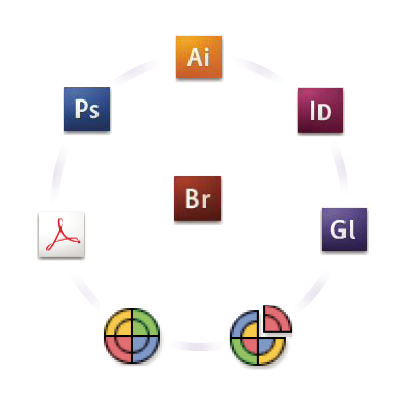
Adobe Bridge Color Workflow
We have created Adobe Creative Suite color setting files that we can provide to designers with instructions on how to install and use them. By having your color settings aligned with the type of work you are doing, what you see on screen will be a more accurate soft-proof than what would result from the default setup.
Previewing Spot Colors
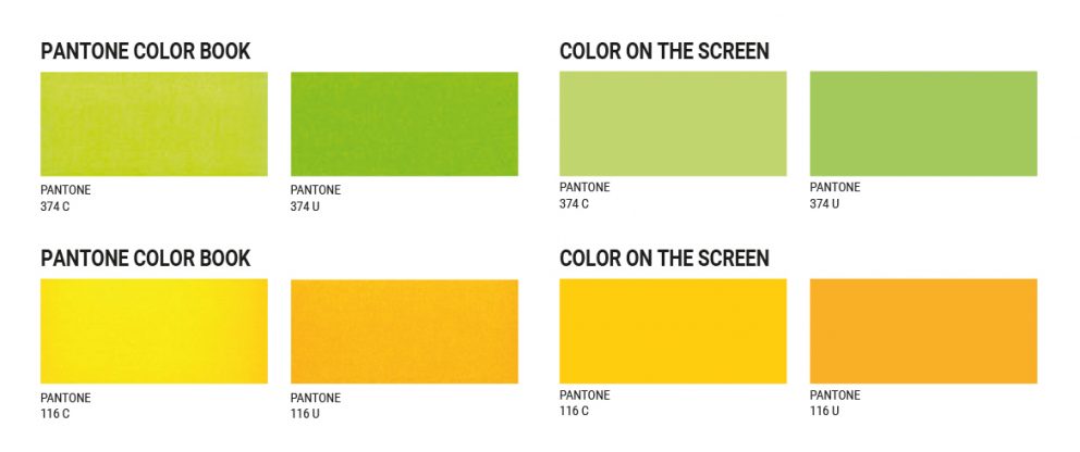
Another issue I see is previewing of spot colors. 99% of the time, we see files that are going to be printed on uncoated stocks setup with Pantone coated colors.

Couple that with the default color setting in the software, and you are setting up an unrealistic expectation on the screen of how that job will actually print. Setting up the file with the proper Pantone coated or uncoated colors can help with a more accurate representation on screen.
Expectations are even further missed when you have digital inkjet equipment printing on uncoated stocks, where those spot colors will be printed in four-color process. One way to allow you to soft-proof more accurately is by turning on an “All Spots to Process” preview if the design software has one (Adobe InDesign does). This allows the designer to have a better idea of how the color is going to move and allow them to make some more informed decisions.
One of the hardest things in the printing industry is managing customer expectations. Understanding how the interaction of paper stock and software settings is going to affect the output will go a long way to making that task easier.
Mike Todryk is a Color Technical Specialist for IWCO Direct. He has more than 20 years of printing industry experience and has specialized in Color Management for the last 18.

