“Can You Print This Pantone Color with Inkjet?”
This is a question we hear over and over. Not just from customers, but from customer representatives, designers and sales people. And how close you can get to a particular Pantone color can be a hard question to answer immediately. Most people know that paper plays a large part in determining the reproducible gamut of a printer, but the important role of the RIP and workflow in which the color is converted is rarely discussed.
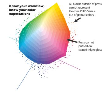
High speed inkjet RIP conversion workflows are becoming more robust and allowing better color conversion of Pantone colors. When a Pantone “spot” color is assigned to a file, its color data is described by its L*A*B* value. With a proper profile and rendering intent, the RIP will process the pantone color as accurately as it can within the scope of the output profile. The RIP uses the Pantone LAB look up library to target the closest reproducible LAB color within the color gamut of the printer, based on the printer’s output profile. It will alter the CMYK “recipe” percentages to match that LAB target.
Another color conversion method is through a preflight process. This converts all spot colors to process during preflight using Pantone’s exact CMYK recipe, in the same way that CMYK color swatch is assigned in Adobe Photoshop or Illustrator. Both of these processes are based on a color value which is printed on a standard paper that is not the same as the one you are using. The CMYK values create an exact recipe which does not allow any alteration of the color value.
Starting with spot colors in the design file with your color conversion workflow dependent on Pantone’s LAB look up table will always be more accurate than pre-converting to CMYK, but not all workflows are designed for this.
Understanding how your workflow and RIP renders colors is an important factor to rendering Pantone spot colors accurately. Your workflow will dictate how designers should assign colors to properly flow through your color conversion process to your inkjet device. Creating standard operation procedures (SOPs) of your process will ensure everyone understands the process as well as how to communicate it to your internal teams and customers.
Keep in mind that any time the CMYK recipe is altered to estimate a Pantone color, the adjustment chosen by an automated solution may not be the one that your customer would choose. So, when it comes to brand color matching, we recommend printing a swatch book for your customer and letting them choose the tint variation that they feel is the best match.
 If you need help with color management or color education, we’re here to help.
Mary
P.S. Check our the downloadable materials available under Customer Education Tools. Become a premium member to download the Customizable Process Color Guide.
