Last week in Color Management as Crayon Space, I posed an impossible task: to arrange crayons in a line according to their color. Color can’t be arranged in a line because it’s three-dimensional. This post will discuss the three dimensions of color: hue angle, lightness value, and chroma/saturation. Again, we’ll play with crayons and some real-life experiments.
Hue angle
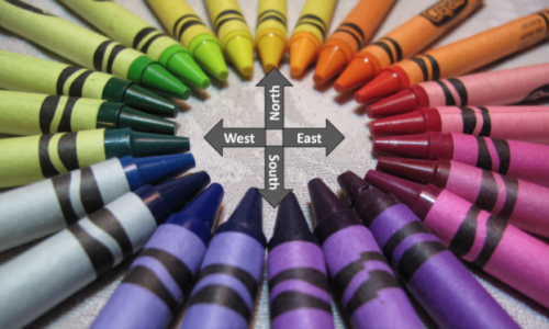
I did an experiment with a group of grade school kids. I gave each one a crayon and asked them to arrange themselves in a gym. After a minute or so, the kids with blueish crayons were all in the same area, and the kids with reddish crayons in another. After a few more minutes, the groups started aligning themselves so that the orange crayon group was between the red and yellow crayon groups.
The next pattern that emerged was the hue circle. With a few exceptions, every crayon has its own unique position on the hue circle. We could begin a standardization of color by saying that the crayon named red is East, the crayon named yellow is North, violet is South, and green is West. Colors in between would get compass name designations like NNE. I think that would be slightly counterclockwise from pure yellow, making it the green yellow crayon.
Or, we could assign a number to each position around the hue circle by saying that the red crayon is at 0°, yellow is 90°, and so on. We will call this the hue angle.
Hugh Jackman, Hugh Grant, Hugh Bonneville, and Hugh Hefner were all standing in a circle…
Lightness value
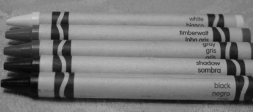
Those poor unfortunate kids with the 96 box only had three neutral colored crayons: black, white, and one shade of gray. Remember the kid who everyone wanted to sit next to in the lunchroom? That kid had the 120 box had five neutral colors.
Little known fact – Ansel Adams had a box of crayons with only five colors
We could give those five crayons a number with black being 1 and white being 5. Or they could be numbered from 1 to 10, or from 0 to 100. Whatever. Any one of them gives us a way to characterize all of the neutral crayons. If Crayola were to decide to create an exclusive 300 crayon box with a few more gray values we can give the new ones a number by comparing the new crayons to a standard set of neutral crayons. We could also assign a lightness value to a white ceramic tile from Home Depot or to Sherwin Williams SW 6002 Essential Gray. (This isn’t just about crayons!)
But what about the non-neutral colors? It is a bit more difficult to match a yellow crayon to shades of gray crayons, but we can all agree that sky blue is closer to white than navy blue is, that the green crayon is closer to black than the yellow one is, and that pink should have a higher lightness value than red.
The image below is my sophomoric attempt at quantifying the lightness values of a bunch of crayons with a hue angle close to 0° (that is, reddish crayons), from red violet at the bottom up to piggy pink. I know that most of the readers of this blog post could come up with more accurate quantifications, but, hey, cut me some slack. My boss only gave me three weeks to work on this image.
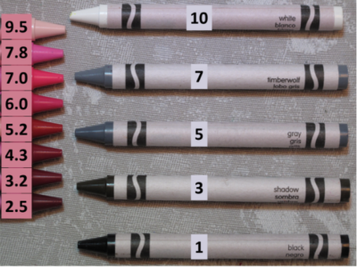
Rate the lightness value of your red crayons on a scale of 1 to 10
Chroma/saturation
Remember those grade schoolers with their crayons in the gym? I mentioned that they discovered the hue circle first. But then they started looking at other crayons in their vicinity and realized that some crayons had a richer color, and other crayons had a color that was closer to gray. The crayons didn’t necessarily differ in their position in the lightness value scale. The crayons differed in their position in the scale from gray to the richest color. The colors differed in what we would call chroma or saturation.
The brown set of crayons in the image below show a gradient in chroma, going from gray to the most saturated brown. All of the crayons have the same lightness value – at least that was my intent. The rightmost rich brown crayon is perhaps a bit too dark.
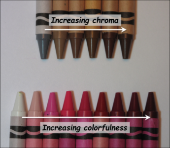
The red crayon gradient demonstrates a slightly different concept, which I have called colorfulness. Notice that the starting point for the colorfulness scale is white, rather than a gray with the same lightness value. Colorfulness is perhaps a more intuitive concept, but four out of five color scientists prefer using chroma to assess their crayons.
Putting the attributes together
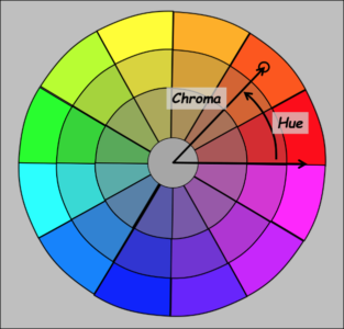
This next image shows how hue and chroma combine to define the orange color identified by the circle. Chroma is the length of the line from the center (neutral gray) to the orange color. The hue angle is the angle between pure red and the orange color.
Darts
The next image shows the combination of lightness value and chroma for that same orange color.
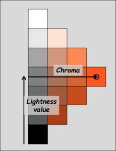
Orange you glad I couldn’t think of a clever caption for this picture?
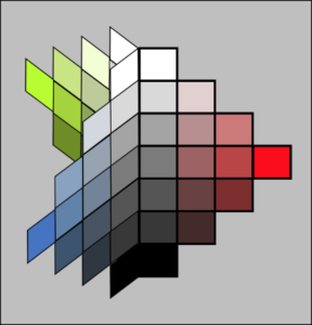
All the colors in the image above have the same hue angle. Well… to be perfectly clear, all the colors except the neutral colors at the far left have the same hue angle. The neutral colors can’t be said to have any hue.
We could create hue cards like this for any number of hues and glue them together at the gray end. The image below shows a three-dimensional view of a color shape created with three hue cards.
Color is three-dimensional
If the hue cards were subdivided into way more little squares, and if a bunch more hue cards were added, then it would be clear that every color has a place in the three-dimensional shape which is kinda like a pair of cones. Thus, any color can be characterized in terms of three attributes: its hue angle, lightness value, and chroma. These three attributes provide a complete and unique characterization for any color. If the three attributes are the same for two colors, then they will be the same color.
Want a little more information on Organizing your crayons? Otherwise, tune in for the next blog post, where we look at a physical realization of these concepts, the Munsell Color Space.
John Seymour is a consultant in color science and mathematical algorithm development. He is also the Vice President of Papers for the Technical Association of the Graphic Arts, and a member of the Committee for Graphic Arts Technologies Standards, and ISO TC 130. Find him on LinkedIn.
*Crayola, Crayola art products and swirl logo design are copyrighted and are a registered trademark of Crayola Properties, Inc.