Many, many years ago, I was taking computer science classes at a local community college. We had a truly wonderful computer science teacher who moonlighted as a Baptist preacher. Dr. Edwards was an extremely smart man with a joyful personality. He had a class policy that if you disagreed with a grade you received, you could get up in front of the class and argue for a better one.
In one particular class, that I will remember forever, an enterprising student received a C and argued for a better grade. He stood up and began to make his impassioned plea. The main issue with the grade revolved around a section of code that was incorrect and not well documented. As the back and forth between the student and teacher continued, Dr. Edwards stated that the section did not do what the student thought it did. The student replied that it SHOULD do what he thought it did. Dr. Edwards replied that it didn’t though, to which this exasperated student shouted, “You Should Have Known What I Meant!” I have never seen a human turn quite that color of purple as Dr. Edwards laid his head down on his desk in gales of laughter. After a full minute, he raised his head and, still giggling, said the student was now getting a B and should please sit down so he could catch his breath.
While this story is mildly amusing, it brings out a point that Print Service Providers (PSPs) struggle with often. We all have a number of well-meaning clients, agencies, etc. that are absolutely certain they are providing all the information needed to get their their jobs and brand colors printed accurately. Unfortunately, there are some gaps in that understanding. More often than not, it is not the fault of said clients, agencies, etc. that these gaps exist. PSPs often do not do a very good job of communicating all that we need to know to print a job and/or brand colors correctly. Whatever the cause, we end up with a “You Should Have Known What I Meant!” moment. I’d like to address three of the biggest gaps that we see in PSPs’ ability to reproduce brand colors correctly.
Differences Between Coated and Uncoated Stocks
One big gap that we see is the understanding of how a brand color is going to print on coated vs uncoated stock. This problem most commonly stems from how the color is usually viewed by the client. Designers often design in one color setting on their design software (like InDesign) without taking into consideration what stock the design will print on. Most often, they are using a color setting that is showing them how everything is going to look on coated stock, even if the design is going to print on uncoated stock. They are often choosing Pantone Coated colors for the job, even if the design is printing on uncoated stock. The difference between coated and uncoated stock can be quite dramatic. The sooner that is understood in the process, the less likelihood of disappointment in a color that doesn’t look as expected.
For PSPs, one thing you can do to resolve this issue is to properly set expectations by providing hardcopy proofs and PDF proofs that are accurate to the substrate the job is printing on. Make sure that you as a PSP understand the differences that stock can make so you can anticipate and answer any questions or concerns the client or their agency may have. It’s also a good idea to ask who will be preparing the art files and, if it’s someone other than your contact, offer to send the specs to the production artist. You might be amazed at how many times someone says, “I thought they would know that.” For designers, set up proper Soft Proofing settings in your software so you can preview the design the way it will print. This may allow you to make some alternative design choices that will enhance the design on the chosen stock.
Why CMYK Values Are Not Always Helpful
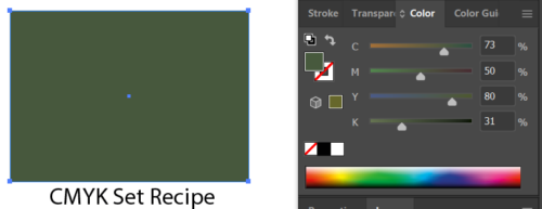
Another gap that pops up constantly is brand colors and brand guides that define colors as CMYK. Now, you may be asking, what’s wrong with that? Those are the CMYK values that are in my file. Those are the CMYK values that we have stressed, debated, and lost sleep over. They look great. Why are those CMYK values not helpful?

The problem is CMYK values only really define what a color looks like when the paper stock and ink it is printing on is understood. I can print the same CMYK values on 10 different printers with 10 different papers and 10 different inks and get 10 wildly different results. One common misunderstanding is that CMYK is the same, no matter what. Unfortunately, that is not the case. CMYK on a sheet-fed offset press is a very different color than CMYK on an inkjet or toner digital press. To make matters worse, the default CMYK color settings in the Adobe Creative Suite (the standard for modern designing) is a 22-year-old print condition (US Web Coated SWOP v2) that no modern printer prints to. What most designers see on the screen is not representative of how the color will actually look when printed. So, what do we do about all that?
For PSPs, understand what press standards you print and proof to and be able to provide color settings and profiles to your clients and their agencies. Explain to them why using these press standards are important. If you are not sure, check with your prepress department. Ask them what they proof to. If you are a G7 Master Printer, you should be proofing and printing to a press standard that is G7 compliant, like GRACoL 2013.

For designers, ask your printer what your color settings should be set to. Ask them to provide settings and profiles if you don’t have those available to you. You can also go to websites like GRACoL.org and download the latest profiles, plus get an idea how to use them. If your printer is a G7 Master printer, they (and you) should be using G7 compliant color settings like the ones found on GRACoL.org. Make sure that when you define CMYK values the printer understands what press standard you are designing for. A good way to do that is to embed color profiles into the PDFs you create. Spending some time educating yourself on color will help you communicate color and is also kinda fun.
How Close is Close Enough?
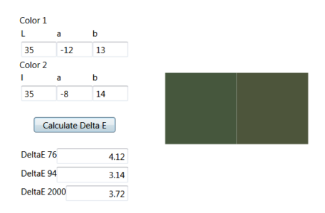
One thing that always seems to cause confusion is “When is close enough close enough?” Most brand guides never indicate what their acceptable tolerance is. This can cause a lot on consternation. All printing processes have a certain amount of variation that can lead to color differences in print. And as much as we wish it was so, no visible difference is not obtainable under most circumstances.
Color differences are usually expressed in a numeric value called delta E (dE). Delta E is simply the difference between two colors. All printers strive for the lowest dE when printing. ISO standards allow for a dE difference of up to 5. IWCO Direct adheres to a dE difference of 3. A 3 delta E difference between two very saturated reds can be barely noticeable. A 3 delta E between two grays would be very noticeable.

If you are a PSP, you should be very open regarding the tolerances you adhere to. Make sure you are checking your color and be able to provide a report to show how well you are staying within tolerances. If you are a designer or client, educate yourself on what color differences look like. Understand that there is no such thing as a perfect match. Learn how to communicate what is important to you and also when to compromise.
Putting It All Together
People and companies invest an enormous amount of time and money in their brand colors. As PSPs, we should strive to reproduce these colors as closely as possible. We can do that by making sure we ask the right questions and gather the right information. As designers and brand owners, we help the process by making sure that we provide complete and accurate information about our brand colors. Together, we can make sure that everyone “knows what we meant.”
While every effort has been made to make this article clear and simple, it does contain some technical information and terminology. If despite my best efforts, the information seems confusing, please ask questions in the comments and I will provide further clarification.

Mike Todryk is a Color Technical Specialist for IWCO Direct. He has more than 20 years of printing industry experience and has specialized in Color Management. It’s always great to get perspectives directly from inkjet users in the field and Inkjet Insight greatly appreciates the participation and leadership IWCO Direct has shown in sharing their experiences.


Comments
Good piece