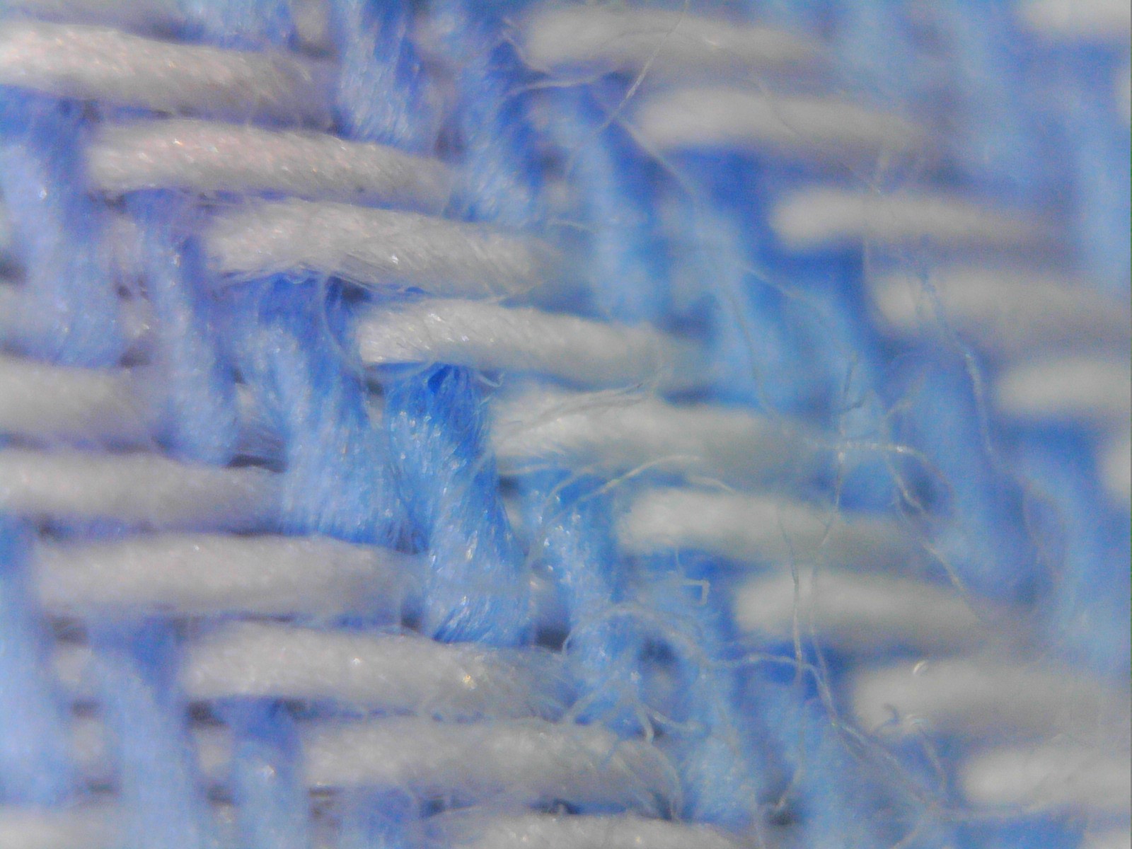
Example of textile of two dyed threads, irrelevant to this blog post, but cool looking
I entered this with a fair amount of naivete. I had heard that the romance between inkjet and cloth was just starting to get steamy. The idea of customizable fashion where someone can upload a design and have a dress printed and shipped that day is alluring. The idea that a home furnishing company can offer a boatload of colors and patterns of drapes without having to stock anything but the raw cloth is exciting. The idea of “on-shoring” of small-scale manufacturing of printed shirts at micro-factories in the US is pretty cool.
So, when someone suggested the idea to offer a session on digital printing of textiles at the TAGA/ISCC conference (March 18 – 21, 2019 in sunny Minneapolis), I decided to jump on it. My thought was that we just need a paper or two about what exciting applications are now possible, and then a basic paper explaining how to tweak the tried and true science of color management tools that were developed for CMYK printing on paper. Voila! We will have a session for people who dye fabric and are contemplating moving into inkjet.
We have the tools
I don’t know if this ever happens to anyone else, but it seems like every time I open my mouth to convince others of my incredible, vast knowledge of a subject, I find myself learning from people who actually do have an incredible, vast knowledge of the subject.
No. You can’t just give a little tweak to the practice of color-management-on-paper. There are just a few wrinkles in the fabric.
Wrinkle #1
The first wrinkle is that fabric has to be preconditioned to accept the pigments that the inkjet heads squirts out. Ok, not such a big deal? I mean, paper companies do that to office paper. But, while paper is pretty much just paper, textiles come in a lot of different flavors (linen, wool, acrylic, and even fiberglass). Each one has its own affinity for ink. It is also common to add a binder to the ink to get it to stick. And when you start adding binders and stuff to an ink, you have to worry about the inkjet head having conniptions, such as jetting inconsistencies.
Some inkjet droplets spread their color love along the fiber, making for good ink mileage.
Some don’t
Of course, as you add binders to the ink, you may get more pigment to stick to the textile, but you also make less room for pigment in each drop. Where is the best balance?
These are all technical problems which are readily solved by testing 3.2 zillion combinations of the various components. But, for those who live in the real world, there is neither time nor manpower to even cover one gazillion permutations. People in the real world also have to deal with people in the real world. The textile supplier, the ink manufacturer, the inkjet head manufacturer, and the printer all have to play well together.
Wrinkle #2
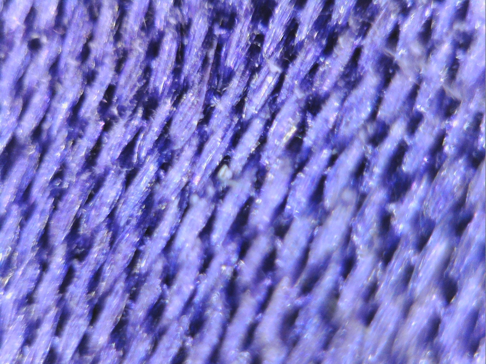
Measuring the color of ink on paper is a relatively simple task. At least today it is. We have had a little over 70 years to play with instruments to measure the color of ink on paper. But textiles aren’t flat, and they have depth. That can cause a problem with 45:0 degree light angle color measurement devices, especially those with small apertures. Changing the way the fabric is piled up, moving the instrument, changing the presentation angle, or even just rotating the spectrophotometer can all change the measurement. So, another wrinkle is that you really should test a variety of flavors of color measurement devices (aperture size? 45:0 or spherical? with or without specular) to make sure they correlate with what you see.
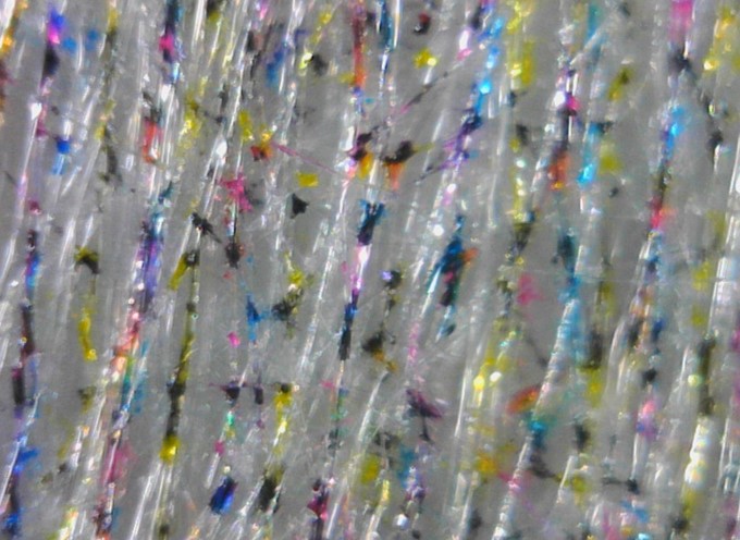
My silk boxers have lots of interesting texture,
which gives it that nice sheen and messes with the spectrophotometers mind
Wrinkle #3
One of the building blocks of color management for ink on paper is a standardized set of CMYK inks. These come along with standardized profiles which predict the color of any combination of inks on selected grades of paper. All you need do is select the right paper type and your color probably will be pretty decent.
So, what about ink on textiles? For a variety of reasons (colorfastness, chemistry, cost, required colors), the standardization of CMYK inks is not an option.
And then there’s the issue of color gamut. Even if it were possible to use standard ISO CMYK inks, the gamut would probably be smaller than any of the standardized profiles. Textiles are matte surfaces, and you just can’t get rich colors when the surface isn’t glossy.
To address this limitation, textile OEM’s have adapted to adding additional colors to their process mix including florescent colors. These extra colors can be used within the profiling process to expand the fabrics color gamut. OEM’s are addressing color vibrancy issues for textiles faster than the commercial inkjet market as fabrics must have vibrancy well past standard ISO color space.
So unfortunately, when you are doing color management on printed textiles, you cannot just use the standard canned profiles or color management software. You pretty much have to develop your own profiles by characterizing the process using software which allows the direct control of each color channel separately. And beware that the process includes not just the inkjet heads, but also the characteristics of the textile that is used and the ink set. As in inkjet on paper, binder is the foundation for textiles to achieving vibrant color. If someone in purchasing decides to change binder chemistry because of cost, the inks compatibility and appearance will change and a new profile will be required for that textile medium.
These are some of the wrinkles with color management on textiles. I hope to hear more of them, and some solutions, at the joint March 2019 TAGA/ISCC conference in Minnesota. Also, SGIA is hosting the Digital Textile Printing Conference 3.0 this December in North Carolina.

JOHN SEYMOUR, COLOR MANAGEMENT CONSULTANT, JOHN THE MATH GUY
John Seymour is a consultant in color science and mathematical algorithm development. He is also the Vice President of Papers for the Technical Association of the Graphic Arts, and a member of the Committee for Graphic Arts Technologies Standards, and ISO TC 130. Find him on LinkedIn.
Inkjet Insight provides color knowledge and resources for commercial and industrial inkjet markets. Please see our continuing Color-Shift Happens series which we will talk about the many attributes which affect color in inkjet.