Traditional transaction documents are turning into “transitional” documents with more personalization, graphics and color. Unfortunately, some of those transactional images are looking a bit ragged. I’ve started counting the number of areas which contain a color bitmap or vector image on the bills and statements I receive. I know that sounds a bit weird, but in doing this, I have seen a gradual increase in graphic areas which are looking to sell or advertise something. As an example, one page of my TV bill (not naming names) contained 8 solid vector areas, 4 bit map images, 2 gray scale images and 1 gray scale image which processed out to a 4 color process (I don’t think they meant to do that) and black text.
On the one hand, this suggests that the company sees a benefit from adding color and graphic content to their printing, as well as seeing customers bills as an advertising opportunity. On the other hand, it says that they are wasting some money in how they are accomplishing it, and a review of their variable data workflow is in order.
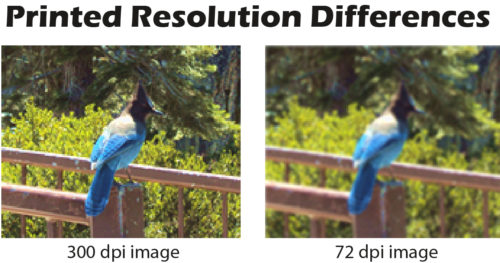
On the example statement statement mentioned earlier, the 3×3 inch continuous tone bitmap image used for advertising printed at a very low resolution which made the image rasterized and grainy. This in turn caused the color to be extremely inaccurate. The image just “followed the rules” for all bitmap images applied by the workflow software and the resulting quality was very poor. It probably ran efficiently but did not provide a good advertising experience – and what’s the point of laying down extra ink on images if they don’t have a good impact?
Transactional and direct mailing markets run millions and millions of prints with variable text and images. More images means more data. Lots of bits and bytes to be processed without choking the RIP. It’s common to see default resolution settings in variable data workflows for transaction printing at around 72-150 dpi for bitmaps because that allows fast processing and streaming to the printer. This is a global resolution decrease affecting all bitmap images as well as their color accuracy. This setting was acceptable when just text and very small solid jpeg logos of approximately an inch made up most transaction print. Now that companies are adding larger continuous tone images requiring detail, these resolution defaults should be changed to reflect the size of the image to keep the images sharp and provide color accuracy.
Its a tricky balance to keep the data stream clean and productive while managing image and color quality. Here’s a good tip:
- If the bitmap image is 1 inch or smaller, the resolution should be no less than 150 dpi
- If the bitmap image is 2″ or larger, set the resolution no less than 300 dpi.
- For most transactional/transitional market documents, 300 dpi may be the highest needed.
- If more detail is required higher resolution is too. Use 600dpi resolution for images with high detail requirements only if your data stream can handle the additional load
Note that printing over 600 dpi will not produce higher quality unless printed on high quality inkjet papers. Testing sample images through your data stream at different resolutions to assess the results against the quality needed is always the best way to ensure you are balancing both throughput and print quality.
You may not think of bill and statements as demanding documents from a quality perspective but keep in mind that they are typically viewed at roughly , arms length (especially by the over 40 crowd) and images must be large enough to be viewed at that difference. Larger images and finer detail requires higher resolution to delivery a good result.
Creating bitmap images in their correct resolution for their printed size, prior to composing the template will help with assigning one set of resolution rules to process all your documents and images efficiently. More than ever, it is important to ensure that whatever you are printing is delivered at the quality the reader should expect with no ragged images, especially if you are trying to sell something and investing in extra ink to do it.
Need help setting better standards, just let us know.
If you find these tips helpful, please register for a free basic membership and we’ll start sending updates to your inbox.