
What is the Criteria for Matching Commercial Print Color?
With many demanding market segments migrating to inkjet, one has to ask what is acceptable print quality? Of course, print quality is not one thing. It’s a series of print characteristics that are often compared to conventional offset.
Print quality expectations vary by market segment such as commercial, direct mail or book production and print quality capabilities differ by the machine, ink chemistry and, of course, the chosen media. Matching expectations with capabilities can be a challenge, but it is nearly impossible if the expectations can’t be quantified and clearly communicated. Let’s start with terminology.
“Commercial Printing” can refer to Print-For-Pay, or be shorthand for offset printing, or for high quality graphic arts printing. For our purposes in this article, we are referring to the latter when we say “commercial printing.” Businesses in this segment want their products to have the highest degree of color and quality. Therefore, commercial print requirements are much tighter than for transactional or book production.
The term “Commercial Print Quality” is used to compare conventional offset with other print methods, another term for this is “Offset Quality” – but what does that really mean?
So, What is “Offset Quality”
This term is often thrown around with no actual data for comparison. Most companies do not understand what this term actually means in respect to measured data. Nonetheless, “offset” is referred to as the holy grail of quality.
When comparing inkjet to offset, print quality is most often only evaluated visually, viewing printed sheets side by side. Customers evaluating inkjet normally do not dig deeper into the measured data for the evaluation. Without data, how can you accurately compare anything?
We will be taking a measured approach to comparing various aspects of quality in a series of articles reviewing several areas of importance when comparing offset to inkjet. We will be looking specifically at:
-
- Color Matching
- Print Defects
- Uniformity
Comparison Process Specifications
For our offset to inkjet comparisons, we started with offset as our Reference press (the sample we are comparing to) an Offset Cold Set process utilizing a sheet-fed MANRolland press with a direct to plate (DTP) process at 200 line screen. We will refer to this as Reference Offset.
We compared the printed output of offset to an aqueous pigment inkjet press which will be referred to as Sample-Inkjet. The Sample-Inkjet press is continuous roll to roll using primer and a CMYK ink set and variable drops sized ranging from 3-8pL. Tests were run at 262fpm at a resolution of 1200×1200. Both printing processes were conducted at the same location with both sheet offset and high-speed inkjet.
For both processes artwork was developed to target CRPC6 GRACol 2013 as well as each system’s pure primary CMYK inks. The paper used was 70# UPM Endurance for offset and 70# UPM Finesse Gloss.
All data values for color measurement and print quality utilized an Xrite Xact and QEA PIAS II.
Color Matching
One of the most common critiques during a purely visual inspection is the difference in color. However, there is a wealth of research that proves that comparing or approving color visually is an imperfect process. Color perception varies from person to person and under different viewing conditions. Best practice is to always measure with a color spectrometer like an X-Rite Xact.
It’s also important to make sure that the items being compared are produced using the same color space target. A color space is a three-dimensional coordinate system which plots three different color qualities (generally hue, value, and chroma) on x, y, and z axes. This allows as color sample to be quantitatively measured, plotted, and consistently described by a single point located somewhere on the coordinate system. The color space targeted in our comparison was based on the CIELAB which utilizes three values: a lightness or darkness value (L*), a red:green value (a*), and a yellow:blue value (b*).
The target color space can vary by press type and media. US commercial offset presses usually target GRACol standards. When conducting any comparison, it is important to ensure both the offset and inkjet color workflow has targeted the same color space. Coated, smooth and uncoated papers can have their own color space targets called CRPC 3, 4, 5 and 6. CRPC is a series color space targets aligning various print processes and papers using CMYK and expanded color process printing to achieve predictable visual similarity between devices. When printing to an uncoated free sheet, calendared or inkjet treated, the target options are CRPC 3 or 4. For coated matte or gloss stock, CRPC 5, 6 or 7 are options depending on reproducible gamut size of the printer. For all papers, it is the paper surface and how the ink sits on the surface which will determine the achievable color gamut. For the best comparison, choose the target which fits both to ensure the test is an equal comparison.
Process inkjet inks are quite different in hue from offset inks. The term ∆E (delta E or dE) is used to describe color differences in the CIELAB color space. The term stems from the Greek letter delta which is used in science to denote difference. The E stands for “Empfindung,” a German wording meaning feeling. Put them together and you get “different feeling” but because we are measuring it is no longer just a feeling – the difference is a fact. For inkjet, a pure process color can vary by as much as 12ΔE compared to a similar offset process color.
To understand the differences in our Reference and Sample process inks, we first looked at the ΔE differences in the primary and secondary solids. Chart 1. shows the wide ΔE differences of pure CMYK inks calculated at dE2000 specifications without targeting the presses to a common color space measuring.
|
ΔE 2000 |
|
|
Cyan |
7.4 |
|
Magenta |
3.1 |
|
Yellow |
5.8 |
|
Black |
9.0 |
|
Red |
2.3 |
|
Green |
5.8 |
|
Blue |
3.6 |
Chart 1. Targeted CRPC6 Offset vs Inkjet Sample – Primary and secondary color difference.
Chart 1. Shows the primary and secondary colors measured from the Sample to the Reference Offset had an overall averaged ΔE of 5.28 with a maximum deviation range of 6.7.
Aiming for a common color space provides a “recipe” for how each process color will be mixed. This new recipe replaces the pure inkjet process colors with a “mixture” of process values bringing the colors in line with offset CIELab* requirements. For our tests, the common target color space was CRPC6 for both devices and a common paper type and weight was chosen.
Targeting a common color space, the inkjet primary colors were mixed to align with the required solid primary and secondary CIELab* requirements of offset.
|
ΔE 2000 |
|
|
Cyan |
1.41 |
|
Magenta |
1.30 |
|
Yellow |
1.16 |
|
Black |
1.57 |
|
Red |
1.37 |
|
Green |
1.29 |
|
Blue |
1.34 |
Chart 2. Targeted CRPC6 R vs Inkjet Sample – primary and secondary color difference.
Chart 2. Clearly shows the primary and secondary colors measured from the Sample to the Reference had an overall averaged difference of 1.34 ΔE with a maximum deviation range of .41. Targeting both the Reference and the Sample color space reduced the overall averaged ΔE to 1.34. Targeting brings both devices closer in line at the primary and secondary color level creating smaller gap in reproducible color differences between printers.
Gray Balance
In color printing, combinations of cyan, magenta, and yellow inks produce neutral shades of gray and result in a gray balance. Improper proportions of any of these colorants will result in one dominant hue, which may or may not be desirable. Humans are most susceptible to small changes in neutral colors, less able to detect changes in saturated colors. Ensuring a consistency of the gray balance throughout the proofing and printing processes is an important step.
So why do we not just use K only to make our grays? There is a large difference the tone value of black ink between offset and inkjet systems as well as the color cast which the ink and paper may introduce.
To achieve neutral grays, CMY values are printed in combinations ranging from 1% to 100%, then measured. The measured values of these blocks, called gray values, define the generation of gray value from the printed CMY ink combinations. Gray balance is achieved when measured gray values are modified to address dot gain, color shift and target a specific CIELAB value to produce a similar visual appearance from one device to another.
Gray balance is fundamental for overall color balance in process color printing. In the example below tone curves of the two printers were measured using just 100%K of both devices. Calculating density and the measured L* value shows inkjet just using K alone (Chart 3) caused a wide difference in gray values than targeting a common color space (Chart 4).
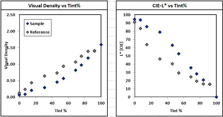
Chart 3. Keeping inkjet 100K v. 100K offset
Inkjet K difference of 9.0ΔE (Chart 2) showed a direct correlation to inkjet gray balance in highlight values (Chart 4). Inkjet 100%K value must be mixed with other process colors calculated to CRPC6 specifications to bring gray balance closer in line with offset as shown in Chart 4 below.
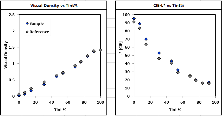
Chart 4. Targeting CRPC6 GRACol
Photographic images from the two printers (Pictures A and B) examined visually also appeared similar in tonal quality once gray balance was achieved with both devices.

Picture A. Highlights to midtones balanced for simulated appearance. Magnification ~ 17µm/pixeI


Picture B. Midtones and shadows balanced for simulated appearance. Magnification ~ 17µm/pixeI

Spot Color Matching
One of the biggest differences in print processes between inkjet and offset is the effort required to use spot colors. There are only a handful of inkjet presses that allow other ink colors beyond CMYK and their approach is based on extending the gamut by adding orange and violet. It is quite expensive to add a specific Pantone color to an inkjet system because the color cannot be easily switched in and out like an offset press can. The cost associated with adding a dedicated print bar to an inkjet press and the chemistry development are prohibitively expensive.
Since this comparison was based on both systems printing only CMYK process colors, we did not compare spot colors, but rather each Pantone was printed as CMYK. To keep the comparison accurate, the conversion for each spot used the Pantone+ Solid Coated conversion within the RIP (raster image processor) targeting CRPC6 with relative rendering intent. The following table below shows the ΔE 2000 measured Pantone values using each device’s standard CMYK ink.
|
Reference-Offset |
Sample-Inkjet |
|
|
Pantone Orange 021 C |
1.39 |
1.75 |
|
Pantone Red 032 C |
1.32 |
1.44 |
|
Pantone Rubine Red C |
1.55 |
1.54 |
|
Pantone Purple C |
1.55 |
1.50 |
|
Pantone Violet C |
1.50 |
1.52 |
|
Pantone Reflex Blue |
1.67 |
1.68 |
|
Pantone Green C |
1.24 |
1.20 |
Chart 5. ΔE was calculated using X-rite Xact internal Pantone+ Solid Coated library.
The goal of this comparison was to show that high speed inkjet systems can indeed produce required color quality on a similar paper* as offset when targeting the same color space utilizing CMYK primary ink sets.
Inkjet is rapidly growing as a valid option to commercial offset. Long lost are the arguments that inkjet cannot match offset quality. Ink development and use of primers compatible with offset coated papers has brought color quality for inkjet to new heights. Advancement in pigment inks created increased hue values and optimized inkjet CMYK process values to align inkjet as a direct competitor with commercial offset.
*Paper compatibility is a key aspect in this study and not all offset papers are compatible with high-speed aqueous inkjet print systems.