To put this blog post into perspective, we are about halfway through the series leading us to an understanding of CIELAB and how it is intended to manage and communicate color. Blogs so far have shown, you cannot arrange all your crayons in a straight line, as color is three-dimensional. Any crayon (or any color for that matter) can be uniquely defined in terms of the three attributes of color: lightness value, chroma, and hue, also known as the Munsell system.
I will introduce the CIELAB color space in an upcoming blog post, but let’s side step a bit to consider how color can be managed using a method called Munsell color system, and its limitations.
What is Munsell you ask?
Not so much of a what, but who. Albert Munsell developed a color space based on an atlas of colors intending to standardize color specification.TheMunsell color system was created to visually identify and match color using an ordered approach. Albert Munsell desired to have a system which artists could describe colors in an accurate way. His system was based on each color charted in an order describing the Hue, Value and Chroma which are the three dimensions of color.
Hue, Value and Chroma
Hue is categorized as red, green, blue, etc. with each given a letter code such as Red (R), Yellow-Red (YR), Green (G), Green-Yellow (GY), and so on.
Value describes the color’s light or dark shade. This is assigned a number value,. 2, 4, 6 with numbers ascending. Values are listed vertically from lightest value to darkest. A lighter value is assigned a higher number than a darker value.
Then there’s Chroma. Chroma is a color’s strength, or purity. Chroma is scaled horizontally, left (weak) to right (strong) starting with a number of 2 and up.

Referenced from the book Controlling Color with the Munsell System
Color management before the Munsell Color Atlas
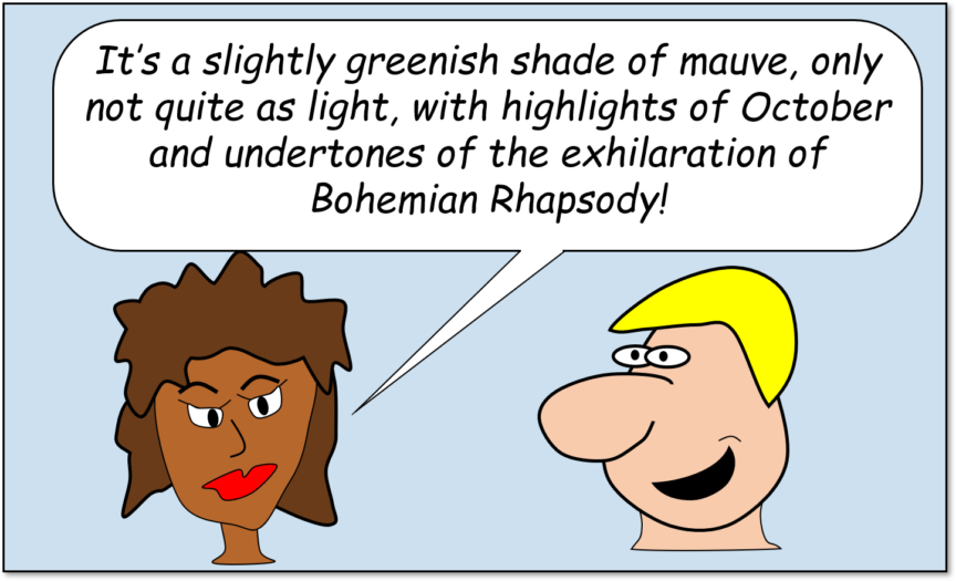
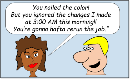
As many conversations go today, the customer has an idea of what the color should be, although this color sometimes is more of a feeling than an actual color which can be referenced or measured.

When color is verbally communicated though description or feeling, we create imaginary colors which are impossible to reproduce. Does this sound familiar to you?
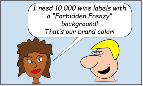
Communication Color with the Munsell Color System
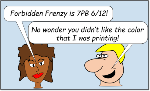
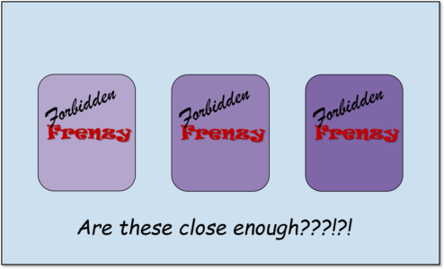
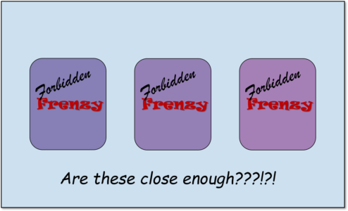
Using the Munsell System, the customer in our comic could have expressed the values, “7.5PB 5/12”. PBsays that it is one set of the purplish-blue shades; the 7.5specifies which one. The 5is the Munsell lightness value, on a scale of 0 to 10. So, Forbidden Frenzy is a little lighter than mid-tone gray. The 12is the Munsell chroma. For reference, a chroma of 20 or 30 is a very rich color, so a chroma of 12 is about halfway between very richand neutral gray. Once the color is identified, the color can be developed as well as compared when printed.
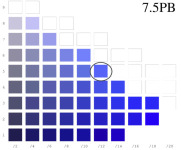
7.5PB 5/12 color swatch reference
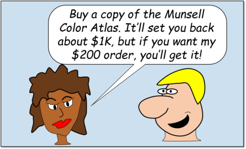
The Munsell System though, can only work if both the client and the printer have accurate books which have been kept out of the sun and have been replaced every 2 years to reference. It is imperative for the Munsell process to work each book must be color accurate to each other.

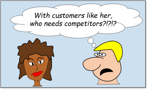
Well we never promised a happy ending. Unfortunately, many times we are so focused or frustrated with color we overlook other small details of the job.
Although, this example shows how Munsell intended color to be described, industry printers and designers do not use the Munsell System, but other means such as Pantone Matching System book, a book from Natural Colour System, the German RAL, a fandeck from Sherwin-Williams or a fabric swatch from Color Solutions international. Honesty, if you communicated Munsell values to a printer, they would look at you like you were crazy.
Why don’t we use the Munsell System?
The Munsell System has a limitation of specifying variance. Because all manufacturing processes have variation there is no description of the range of colors that would be considered acceptable. As we mentioned in the beginning, color is 3 dimensional in which the specified color could be off in any of three directions in color space.
Too blue, just right, and too red
Too dark, just right, and too light
Too gray, just right, too rich
At the very least, Munsell value, hue, and chroma all need to be “in the pocket” for the color to be acceptable. Maybe a hue of between 4PB and 10PB is acceptable? How about a Munsell value between 4.5 and 6.5? Chroma – maybe between 11 and 13? A customer would need to see a range for each to decide the tolerance limits. Complicated, but not intractable.
So, wouldn’t it be nifty if we had not only a device to objectively measure color, but some simple way to set tolerance thresholds for colors in which printers could easily integrate into their processes.
I think somebody has done that already. And I think I feel another blog post coming on…
John Seymour is a consultant in color science and mathematical algorithm development. He is also the Vice President of Papers for the Technical Association of the Graphic Arts, and a member of the Committee for Graphic Arts Technologies Standards, and ISO TC 130. Find him on LinkedIn.