I love Inkjet when it’s Uniform!
Remember our comparison environment from the previous post on graininess? We used a Cold Set process on a sheet-fed MAN Rolland with a direct to plate (DTP) process at 200-line screen (Reference-Offset). Sample-Inkjet is a continuous roll to roll, Primer+CMYK ink set utilizing variable drop which ranged from 3-8pL respectively. Tests were produced at 262fpm at a resolution 1200×1200 with both processes conducted at the same location. The tested media were 70# UPM Endurance for offset and 70# UPM Finesse Gloss and process targeted CRPC6 GraCol 2013.
In this set of examples, we focus on issues with uniformity on offset and inkjet and how to address them.
Measuring Uniformity
Uniformity measures the variance in color or density when an ink prints darker or lighter within a small area of view across or down web. When the color variance is significant it is no longer “uniform.” This lack of uniformity presents itself as visible banding.
Inkjet, as well as offset, can experience banding in some form. Banding in offset is caused by various reasons such as roller marks or plate impression differences, seen flat tints or graduated screens. If banding happens in offset, it is visible across one or all printed colors.
Inkjet presses have multiple print heads mounted across the press for each process color and if any of those heads are not jetting evenly relative to the others, the color can shift in density or hue from one side of the press to the other creating cross process banding.
Print head banding will occur in solid tints and can be created in single process or combined colors. The banding affect is the width of a print head, or the heads chip set, and runs evenly in press direction. The level of visibility will vary depending on the process color affected. In some cases, the banding could be barely visible or completely invisible to the naked eye.

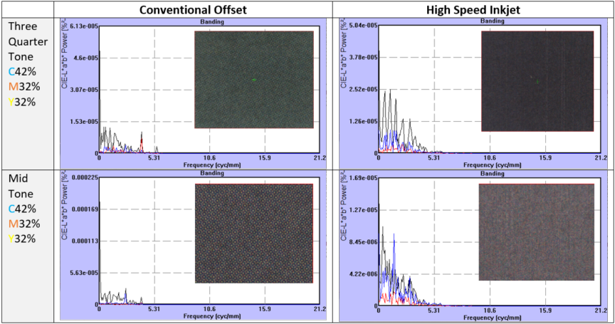
Image H: Offset – Down Web Banding Image I: Inkjet Print Heads – Cross Process Banding
Banding caused by inkjet print heads is different than coating streaking. Coating streaks happens in the press direction and are caused by uneven coating application on the media to which the jetted row of ink reacts, spreading unevenly. This effect does not form straight columns down web like print head banding but will move around and shapeshift creating sporadic lines or splotchiness. It is important to understand the differences as it will help pinpoint the issue more efficiently. Coating streaking happens when the media coating does not allow the inkjet ink to wet out evenly.
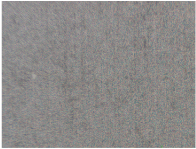
Image J: Paper Coating – Down Web Banding
To gain a full understanding of uniformity and visual disturbances we should also measure the noise within an area. The power and frequency of noise relates to visual disturbance.
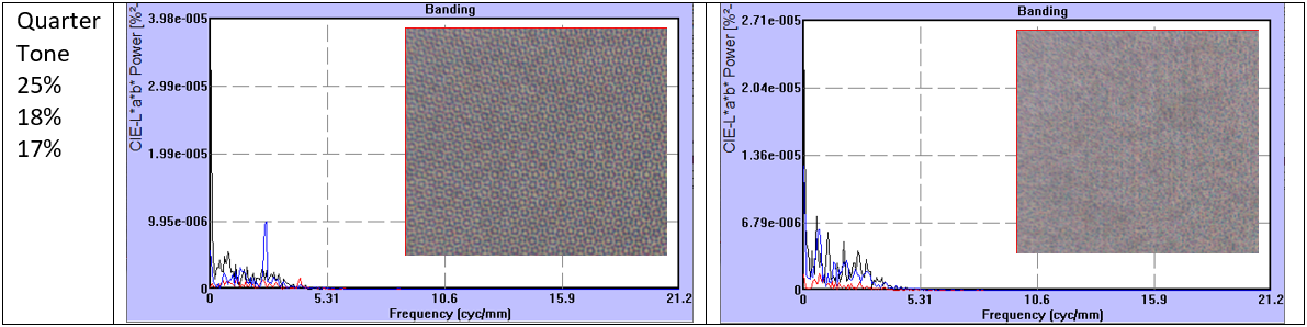
Image K: Banding CMY gray measured using CIELab VTF function showing intensity and frequency of visual disturbance.
Image capture at ~37µm/pixel. .5 cycle/mm
Black=L*, R=a*, B=b*
The NPS banding measurement and calculation technique uses a Human Visual Transfer Function (VTF) that simulates the sensitivity of the human eye. 1NPS performs a 1D Fourier Transform on the reflectance profile to obtain the Weiner spectrum. This tool is useful for correlating banding analyses with visual inspection results. The output of a banding analysis uses high- and low-frequency response based on a reflectance profile which measures the noise variance of spatial frequency per millimeter, providing a detailed analysis of image noise.
Perceived severity of banding is dependent upon:
- Percentage contrast of bands to surrounding density
- Banding frequency
- Observer viewing distance
From measured conditions in Image K (above), offset displays a low percentage of variance and frequency of banding which correlates with showing no visual disturbance across gray tone print blocks. The inkjet samples though, clearly show a banding visual disturbance increasing with the density of the combined CMY gray swatch. The three-quarter tone block shows larger L* spikes and is similar in frequency of occurrence to the a*b*. This is to be expected as jet-outs are seen in this dense color and any print voids will create wider differences in visual density.
As tone deceases in the mid-tone swatch, L* decreases in variance with b* increasing in both variance and frequency, thus showing a wider visual disturbance than the three-quarter tone area. Although, the quarter tone swatch shows the lowest measurements in variance, frequency stays even with L*b*, resulting lower reflectance reducing visual density differences lessening banding appearance.
This test shows the higher power percentage variance and the frequency per millimeter directly correlate to visual disturbance. This can also apply when only L* in the light and dark aspect of the image has the larger percentage variance than a*b*.
To reduce print head banding, perform a uniformity check. For most inkjet presses, the device prints a test pattern and reads all print heads of a single color to perform an averaging to even the appearance across the web. This helps in most cases, but if your heads are at the end of their life, the system will take the lowest value head adjusting other heads to the lowest denominator, thus causing an overall color shift. It is best practice to check once a week and log the hours on print heads to see if they are close to end of life before doing a uniformity check, especially in the middle of a print run. Any time a uniformity check is conducted, keep a log of the top end densities to verify and control color variance which will affect your color managed press. Keep any variance < .03 density difference with your uniformity color density changes as .04 or > = 1.0 dE; 4 process colors changing .04 = 4.0 dE difference. Changing out a head will be cheaper than a series of print or color rejections.
Another type of banding in inkjet is called comb banding. With more creative ink chemistry, this effect is becoming less of an issue, but it is good to know what it is. Comb banding is the appearance of vertical lines running press direction, this happens due to low surface energy which prevents the jetted drops from spreading in single pass inkjet printing. This characteristic will display a gap between each drop row to drop row across the entire print width as the ink is repelling from the media. Leaving an appearance which looks like the ink was applied with a “comb”.
Stay tuned for our Part 4 article which address inkjet specific pain points, the notorious jet outs.
1http://www.qea.com/upload/files/products/2007ICJ_PIAS-II_070613.pdf
*This article was not commissioned so the inkjet Sample A is not disclosed
** Offset and Inkjet print runs were independently paid projects with no comparison direction to the printer.