I recently wrote about the importance of visual data and how designers bring data to life with storytelling.
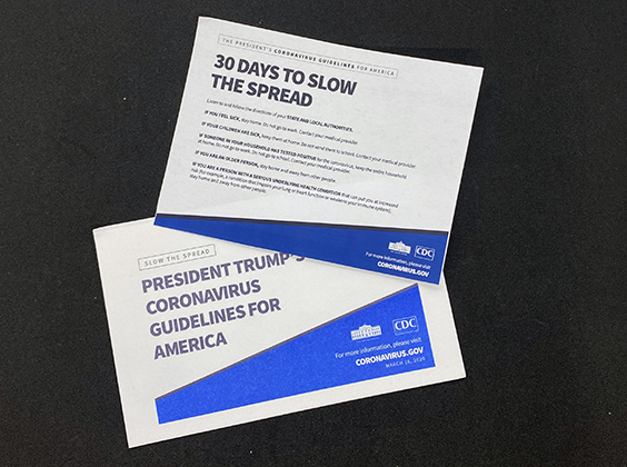
We are several weeks in a ‘shelter in place,’ work from home reality. My days are filled with emails, calls and video conferences. Like many others, I am confined to my house and a simple trip to the mailbox has become a welcome activity. After waiting the recommended 24-hours before touching mail, I now spend a few extra minutes reading my mail – even the direct mail. Earlier this month I, along with millions of other American, received a postcard from the U.S. government about the coronavirus guidelines. I am not a mind reader, but looking at the postcard, my assumption was that the government wants to raise awareness on how individuals can slow the spread of the virus. The postcard lists some of the essential actions such as avoiding social gatherings and staying at home if you feel sick. The card provides the URL, coronavirus.gov, to find more information.
The overall intent of the postcard is good. citizens throughout the U.S. need accurate information and reminders on how to stop the spread of the virus. However, the design and execution of this communication are frankly, horrific. This was a design fail in general and specifically with respect to designing effectively for inkjet.
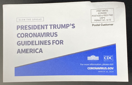
Figure 1: The front of the COVID-19 Postcard has an extremely large margin. and the poor trimming makes it appear like it needs to be opened.
Design Mistakes Lessen Impact
While there were a number of design and production issues with this postcard, here are the 3 biggest mistakes (in my opinion) with the mailing and what the government could have done differently.
Mistake 1 – Type Size
The postcard used 7-point fonts. Unless you have 20/20 vision, a 7-point type is difficult for most people to read. The US government guidelines for the elderly state that the minimum font size is 12 points. (The website even has a quote saying, “I like when I can read the words without my reading glasses.”
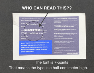
Figure 2: The material is so thin; it needs to be glued. The ink bleeds into the text and the large margin is extreme.
When the font and point size are difficult to read, people will skim over it or worse not read it at all. With important public notices or even regular direct mail, you want the font and point size to be easy to read for both younger and older recipients.
Fix:
- The smallest font should be 12 points. For critical content, 14 points or larger should be used.
- Direct mail content written in serif fonts are perceived to have higher credibility than sans serif. While there is inconclusive evidence to say if type is easier to read as sans serif or serif fonts. Serif fonts are also a better choice for anyone with dyslexia or a learning disability.
Mistake 2 – Color Choices
Color is a great way to grab attention and make specific messages stand out. In the case of this postcard the government used three colors – black, bright blue, and a dark blueish, purplish color. Because of the stock paper selected for the mailer, it is unclear if the dark color is blue or purple. The highly absorbent and thin newspaper grade media used for the postcard made it difficult to produce crisp text and solid colors. The ink used is absorbed straight into the paper.
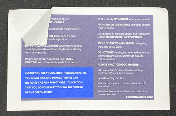
The back of the postcard has an enormous white border. I can’t tell if this was intentional or a limitation of the equipment. In either case, it looks childish. The large white border takes valuable space away from the design that would have allowed typography to be used more effectively.
The overall contrast on the card is good. However, reversing the colors, on uncoated, thin material allows the ink to bleed, making the fonts smaller.
Fix:
- There should be no question of what colors are used. Use three identifiable colors. In this case, red could have drawn the readers’ eye to specific areas. Colors, like fonts, can play a specific purpose in a design. If used correctly, color can help convey your message and grab the reader’s attention.
- White background with a clear, crisp dark type would create a high level of contrast.
Mistake 3 – Paper
The quality of the paper used for this postcard is cheap and thin. The paper was so thin that the front and the back are glued together to make the postcard a reasonable weight for the mail system to process. The seam and cut of the two sides originally made me think I should open the mailer. I quickly realized it was poorly trimmed. You can see on the upper corner of the images where the two pieces separated.
I realize that mailing postcards to millions of Americans comes with a cost and our government is not an endless bank. But I have to think there were other cost-effective paper options available that would have delivered a better (and more lasting result) with readers.
Fix:
- Calendaring paper makes it smooth. A smooth and treated paper can bring sharpness to beautiful edges and make images and text crisp. This postcard could have been printed on a heavy paper with a coating or lamination.
- Soft touch lamination, sometimes called Cellotouch, protects the paper, giving it a matt effect and soft, velvet-like texture. The satin finish makes mailers pop, without making it super glossy, and challenging to read for some age groups.
- Yes, this comes at a higher cost than other laminations. If price is a concern, look at a flood varnish.
- A heavier paper would have avoided the need for gluing and made the trimming of the sheets easier and cleaner. This wasn’t a cheap mailer – it just looks like it was.
Other considerations:
- Graphics. Visual icons are a great way to compliment this kind of content. People don’t read every detail, and icons can help deliver the message faster. Here is a an example from the city of Denver.
- Tactile: There are several types of visual impairments, besides colorblindness, or blindness. Adding a tactile UV coating enables the use of a clear brail on the card. Or use a spot varnish to focus the reader’s attention on specific areas.
- QR Codes: Writing the name of a website is not enough. Today, digital documents have hyperlinks to allow users to click on the site. For physical material, a QR code can be used for the same purpose. The reader uses their smartphone to scan the code, which takes them to the website, for additional information, visuals or videos.
- Post: Mail is a great way to communicate. It is tactile, and I can save it, stick it to my fridge and keep it as a reminder. It is less likely to get lost or overlooked compared to email. This card was sent to every household, making addresses unnecessary. The U.S. Postal system sets requirements for mail.
- Example: Postcards come in two possible sizes.
- The design should not be less than 3 ½ inches high and 5 ½ inches long with a thickness of 0.007.
- The design should not be more than 4 ¼ inches high and 6 inches long with a thickness of 0.016 inch.
- The U.S. Postal service offers a range of specifications for postage marks, bar codes, addresses and more. You can find more information here , or you can ask your print provider.
- Any variations outside the U.S Postal service specifications will incur a higher shipping rate.
- Example: Postcards come in two possible sizes.

Whether it is a website, email or direct mail campaign, catalog or postcard, always design with a purpose. Every word, color, font and material should have a purpose and intent. They need to communicate your message. This is what separates good design from bad.
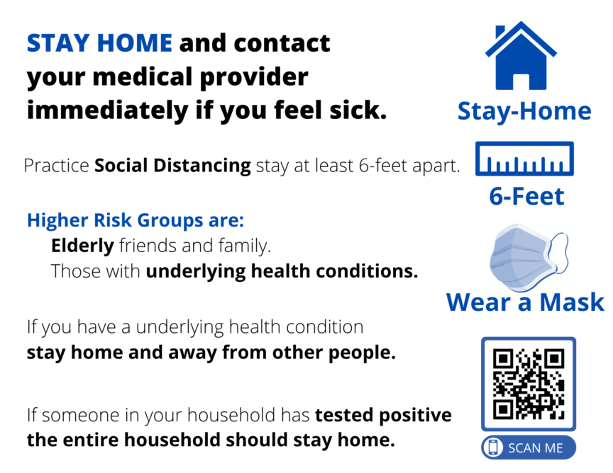
What is particularly sad is that the original government postcard design was somewhat better. It had important information on the front of the card. It avoids unnecessary verbiage, some type fonts are considerably larger, and it is a full bleed. This was revised to replace most of the front copy with “President Trump’s Coronavirus Guidelines for America” forcing important text to the back and reducing the size of the copy.
The original postcard design can be found here.