Color shifts can happen, and when it does, it may become unacceptable and even embarrassing when they are visually obvious. For our first segment of our Color Shift Happens series, we will discuss why it is important to add industry proven methods to evaluate color.
One challenge is that we all see color differently and do not have the same visual acuity. Recently I wrote a post on Color Vision Deficiencies and touched upon the various deficiencies effecting observers. Each of us do not see color the same way and to make matters worse, the color we see will also be different based on the quality of lighting, paper reflection and the surrounding printed colors.
The first thing to check in your process is how you’re evaluating color. If your customers or anyone on your staff are visually checking color, you have found your biggest variable in your process. Color is subjective and should never be manipulated based on visual review. This makes everything in your process unstable, useless and unrepeatable regardless of your inkjet process or media.
Printed images hide visual color shifts more easily, but areas such as solid backgrounds or logo colors, the smallest shifts are more obvious to the eye. In inkjet, we print A LOT of solids for logos and color impact.
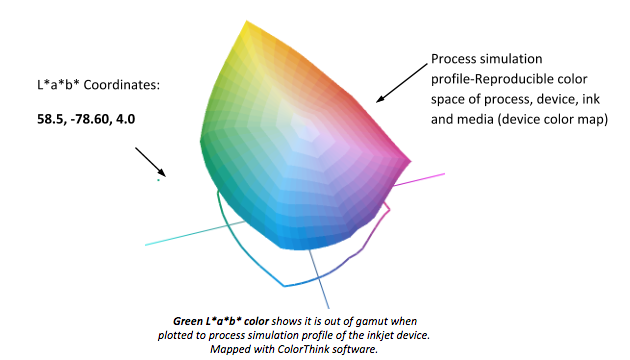
For those moving into inkjet from conventional print methods, I would hope you haven’t fallen into the visual color assessment trap. For those industrial developers and users of single pass, XY, web or sheet fed equipment as you define your process, you must also map your color accuracy to track repeatability. If you are printing on media from paper and labels to golf balls and glass, you should understand the color range for your process from a scientific perspective using a spectrophotometer and your devices simulation profile (discussed further in a later post).
Spectrophotometers are color measurement devices designed to capture and evaluate color from a display through proofing and printing on media such as plastics, paper, metal and fabrics. Spectrophotometers can measure a color’s “coordinates” within the color spectrum. Measured in L*a*b*, a color is identified and can be mapped to a devices simulation profile like a “geographic color address”. The colors lightness (L*), its red/green (a*) and yellow blue (b*) attributes tell us where a color falls, in or out of gamut within our reproducible color space.
When comparing L*a*b* measured colors, differences are called Delta E, often written as dE or ΔE*. The calculations used are 76, 94 (an improved 76) and 2000 each with an increasing complexity of calculation. Delta E is measure of change in visual perception of two given colors. The larger the Delta E difference, the higher the visual color shift.
Out of the 3, Delta E 2000 is becoming more accepted in conventional and package printing. Delta E 2000 has an improved calculation which more closely models the human eye than 76 and 94. Depending on where the colors lightness value falls, dE2000 allows a wider L* variance.
If you would like to get deeper into the dE and their calculations go to: http://www.colorwiki.com/wiki/Delta_E:_The_Color_Difference
The image below is from an X-Rite eXact Spectrophotometer. The image is showing the measurement of 2 printed swatches from the Uncoated Pantone Color Bridge to calculate dE2000 color differences between spot and process value swatches.
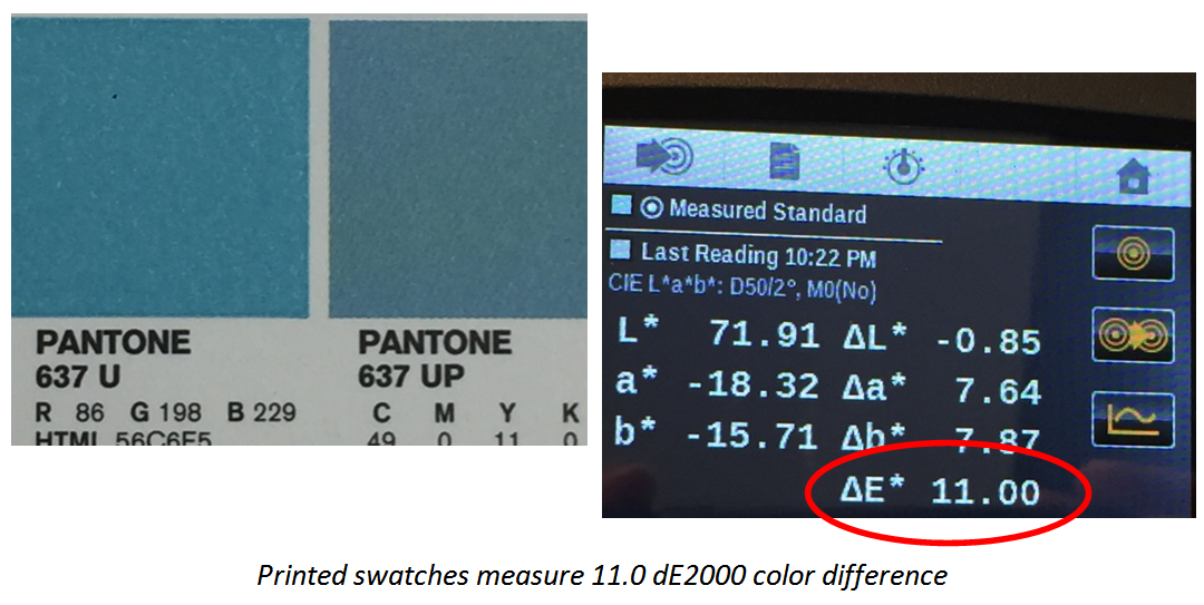
Each industry has different acceptable Delta E tolerances with commercial printing being < 4 and packaging being the tightest at 2.0. If Delta E difference is a number showing how ‘far apart’ two colors are, tolerance is the interpretation of the number. By setting a tolerance level, you can define what is acceptable and what should be rejected.
Currently, there is not an established Delta E tolerance for production inkjet printing. With inkjet using many different print heads, ink chemistries and colorants on varying media and treatments, the range of colors which can be reproduced accurately (within 2-4dE) varies.
Production and industrial inkjet are different processes and depending on the jetting, ink and media you may be using, you will find you may have different tolerances than conventional industries. The delta range for your process should be tested and tolerances set for your process, machine, ink, media and process can achieve. Spectrophotometers will help you determine your range of achievable print tolerances from proof to print in a scientific way, creating clarification and eliminating any color subjective or emotional distress for you and your customers.