
This year, Pantone decided to remove their libraries from the Adobe Creative Cloud, where they have been available to designers for decades. There’s been no shortage of words on this subject (including a few words from Mary Schilling here at Inkjet Insight). My intention is not to add to that discussion. I would like to share my thoughts on how Pantone interconnects designers and printers, for good and bad.
Early Use – Color Consistency
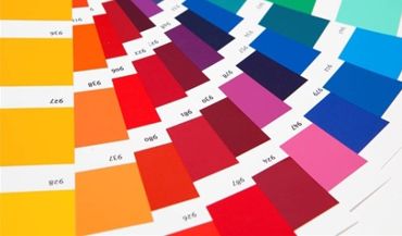
Lawrence Herbert founded Pantone® as a company in 1962. Herbert had been a part-time employee for a commercial printer, working on systematizing and simplifying the company’s stock of pigments. He was so good at it, he ended up buying the company. Pantone’s system of printed color fan guides and ink formulas was a revolutionary idea and was widely adopted over time. The idea of having a consistent set of known colors which people can share and match halfway around town, or halfway around the world, is is still relevant today. In the 60s and 70s, when designs were often simpler with big, bold colors, printing things with black and a couple of Pantone spot color inks worked well. It also helped that conventional printing was the norm, so 5/1 or 6/2 was workable.
Of course, anyone who has ever used Pantone books knows some of the issues there: Pantone books age, and colors can vary from book to book. In working with a customer and their Pantone books, we measured six different books and compared them to PantoneLIVE®. The closest was a 1.2 dE off. The farthest was off 5.6 dE. The other problem with matching just with books is that it requires a visual component, so lighting, color-blindness, and a whole host of other issues occur. Still, the initial idea was good enough to become the de facto standard for Color Matching Systems.
All Things to All People – Choice
Fast forward, Pantone is growing and adding features. We now have Neon, Pastel, and Metallic color options. Starting in 2000, Pantone began releasing a Color of the Year. We also now have integration into design software, most notably the Adobe Creative Cloud. Almost all brand owners are now using a Pantone color to identify their brand color. Some U.S. states have legislated PMS standards to define the colors of their flags. Pantone is everywhere. All of this choice can come along with issues. In my experience, the majority of issues come from a lack of education and understanding. Many designers may not understand that the vast majority of Pantone colors are not obtainable in CMYK. In the early days, most designers understood that choosing a Pantone color meant having a special ink. In our new digital world, this is rarely possible.
Another misunderstanding came with designing for the web. With worldwide adoption of the internet and online advertising, the majority of brand marketers are designing for the web first. Creative is translated to a print environment later. For web design, Pantones are just pretty colors to be used, with little thought, or maybe understanding, to how they will translate onto a printed piece. We have had designs come in for uncoated stocks with colors specified as Pantone C (for coated stock). Or worse yet, a mixture of Pantone C and U numbers. Another one of our clients, who is all digital, picked their new brand colors. All six colors were screaming neon. Of the six, the closest one to print in CMYK was a 5 dE. Most were over a 10 dE. Which leads us to…
Increase in CMYK Digital – Pain
IWCO Direct has moved a number of our litho clients to our digital platforms, like our new HP PageWide presses. The biggest sticking point for most of our clients? Inkjet presses using CMYK can’t precisely match their previous litho pieces printed with spot colors on our digital inkjet presses. Some clients have worked through the issues quickly after discussing tradeoffs like personalization and overrun savings. It took long periods of testing to convince others to make the change.
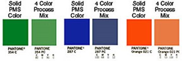
The interesting part is that the industry has much better matching tools than we have ever had. Many RIPs have Pantone LAB values included. There is now widespread use of spectrophotometers. The Pantone colors in the Creative Cloud (until they were taken out) were more accurate than ever. Excellent process control software is available to monitor and validate. PantoneLIVE is also readily available.
Bridging the Gap
What are some concrete things we can do to bridge the gaps? Here are a couple of ideas:
- Use all of the tools that are available. The more you can use standardized LAB values, like those from PantoneLIVE, the more consistent you will be. If you are using spot inks conventionally that are supposed to be a Pantone color, use validation tools to confirm that it actually matches Pantone LAB values. Use a Pantone book as a last resort, and only after you have validated the book. Make sure any Pantone libraries within your digital presses are consistent, both in values and rendering intents. The more that can be standardized, the more you can use the Pantone system as it was originally intended.
- Educate your customers on the differences between Pantone on a display and how it translates to a CMYK digital press. IWCO Direct works with clients to help all parties understand the benefits and limitations of the Pantone library as a matching system. Try to educate the designers who work with you on the various ways they can accurately see how their designs will look when printed. Proper color settings in the Creative Cloud, understanding of how to use Proof Colors in the Cloud, and using the Ink Manger to see how a design will look in CMYK are all good starting points.
- Remember that while Pantone is the big dog, there are other spot matching systems that are CMYK based that people can use. The Spot Matching System (SMS) from Spot-Nordic comes to mind, as an example.
Summary
Pantone has long been a great contributor to the printing industry and should be commended. Their contributions have not been without some issues, but a lot of them can be mitigated though better standards and education. As Pantone pulls out of the Adobe Creative Cloud, it could open the door to other players coming in, and competition is always a good thing.